
12 Days of Impact: A Step-by-Step Guide for Creating Your Organization's Impact Report - Dec. 2, 2025
2025 is swiftly coming to a close: a time for year-end recaps, strategic community engagement, and 2026 kickoff. Often, this means . . . it’s time for your impact report!
If creating your organization’s impact report fills you with dread, I am here to dissipate it. Writing about impact is one of my favorite parts of the work we do at Magenta. Before we log off and jump into the 12 Days of Christmas, I’m taking these “12 Days of Impact” to share bite-sized, step-by-step tips to help you create a clear, concise, and compelling report.
Day 1: Time your report to share with captive audiences.
Before we get too excited about drafting our impact report, let’s think about timing. The last thing we want is to spend weeks putting together a huge document that doesn’t get any traction. Some thoughts for distributing a report for maximum engagement:
- When does your fundraising season pick up? For example, we worked with the Woodruff Arts Center to distribute their impact report for the previous fiscal year (June - May) at the launch of their Corporate Fundraising Campaign in August, which was celebrated with a kickoff event.
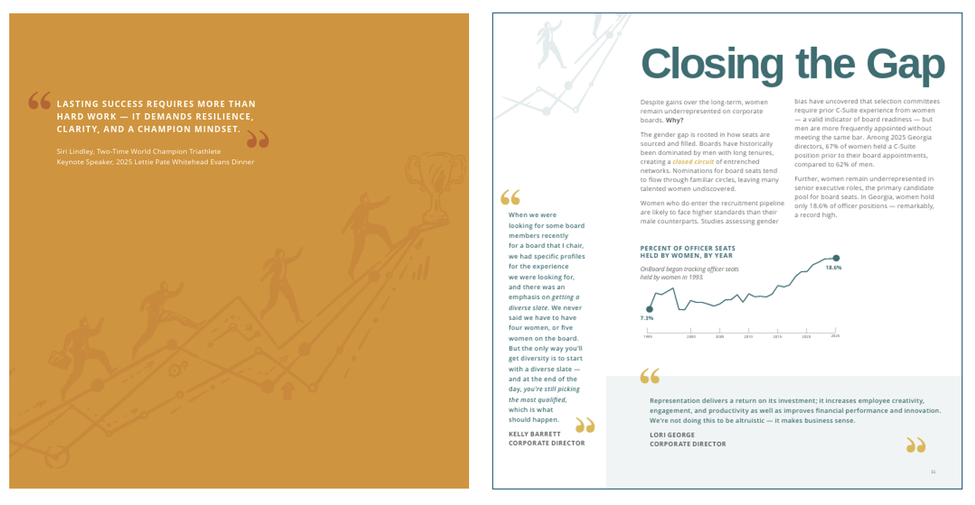
- When do you know you’ll have a “captive audience,” or a room full of people primed to listen to your story? For example, OnBoard shares the findings of their Annual Study at the yearly Lettie Pate Whitehead Evans Dinner and sends each attendee home with a copy—all before rolling out their digital distribution strategy.

An OnBoard member reads the Annual Study during their flagship event.
In general, releasing your impact report just before Thanksgiving pairs well with a year-end appeal, and distributing it in January starts the year off with a bang. If you don’t get around to distributing your 2025 impact report until April, folks will have already have been pulled in other directions.
Plan ahead! At Magenta, believe it or not, we’re already booking projects late into 2026. It’s never too early to get on our calendar! Book a discovery call.
Day 2: Consider your format.
The glossy printed booklet with pages of donor lists definitely has its place in the universe, and at Magenta, we certainly love producing those long-form documents . . . but it might not be necessary for your organization.
So think first: How will you use this report? Is it something you’ll take with you to in-person meetings, a piece that will be emailed to donors, a presentation you’ll share at events, or something you hope new audience members will come across when searching for causes like yours?
Then ask: Who’s reading it, and how much detail do they need to buy into your message?
Answering these questions will help you narrow down whether your impact report will be best presented as a booklet, a one pager, a slideshow, or a webpage . . . or perhaps something else!
As an example, we developed ATL Collective’s impact report as a slide deck which they presented at their live events. Audience members followed up with praise and specific questions related to ATL Collective’s programs — whereas if it had been mailed to them in booklet form, they may have never cracked it open.
Day 3: Identify a mission-centric theme.
The fastest way to overwhelm an impact report is trying to include every single thing your organization did in the last year.
Instead, start by anchoring your report around one mission-aligned theme. It really doesn’t have to be anything groundbreaking: a line from your mission is often perfect. As you get into the rhythm of creating annual reports year-over-year, you can branch out with metaphors and analogies for your theme.
Most impact reports are overstuffed with disconnected ideas. Keep yours clear and concise with a strong, simple theme.
My favorite theme so far: We tied OnBoard’s mission to achieve gender parity in corporate leadership with the keynote speaker for their flagship event, Siri Lindley, a world-champion triathlete. The 2025 Annual Study is titled “Endurance on the Race to Parity” with racing motifs woven throughout. Illustrations and phrases like "Closing the Gap" reinforce the metaphor of leaders racing toward gender parity in corporate leadership.
Advising on the best timing, format, and theme for your organization is part of Magenta’s impact report offering.
Day 4: Choose 3 - 4 pillars within your theme to outline your report.
Once you’ve defined your theme, your “pillars” will give the report its structure.
If your theme uses a line from your organization’s mission statement, you can simply carry your mission pillars into your report as section headers. Core values are another good place to start.
To understand what I mean, consider two organizations. The first uses the section headers “Programs,” “Impact,” and “Events” in their report. This means recipients have to read further into each section to learn anything about the organization. Moreover, outlining the report in this way implies that programs and events are separate from impact, when in fact, all of a nonprofit’s activities should be centered around it.
The second organization, Magenta’s client Lenbrook, used their tagline “Here You Can” as their theme. Under our recommendation, their Annual Report is outlined into sections, Here You Can: (1) Connect, (2) Live Well, (3) Be Fulfilled, and (4) Expect Excellence. Before even flipping past the Table of Contents, the reader can clearly see that Lenbrook is a wonderful place to be for four specific reasons. Reading into each section will prove why. Which brings us to Day 5:
Day 5: Focus on impact, NOT activities.
Days 5, 6, 7, and 8 will focus on the most important part of your impact report: your track record.
An important distinction about your track record up front: Activities are what you did. Impact is what changed as a result of your activities.
Many organizations try to communicate impact by sharing how many things they did over the course of a year. However, every non-impact-focused sentence in your report takes away from the content that demonstrates the real progress you made.
Readers don’t need a full page narrative about every program, task, and operational decision you executed in a given time period. Rather, they’re looking to answer a question: are you closer to achieving your mission than you were a year ago?
Instead, consider the highlights you want to stand out in this concise, compelling summary of your organization’s progress, while putting details about ongoing programs and activities in an “appendices” that can be linked in the report to separate webpages and materials.
Day 6: Put outcomes in context with your mission.
Each outcome you share should be a “proof point” demonstrating how your organization achieves its mission. You can clearly tie these outcomes to organizational purpose by organizing metrics under the various core pillars, or subheadings, you identified on Day 4.
By framing outcomes within mission context, your annual report transforms from a recap of the year to a persuasive track record that builds the case for why donors should choose your organization.
Start by identifying a “leading concept” that you want to communicate for each pillar. Here’s an example Magenta used recently with our partner, Lenbrook:
- Mission: We engage together every day, nurturing an exceptional community where individuals can pursue connection, well-being, and fulfillment.
- Pillar #1: Connect
- Leading Concept: Lenbrook nurtures active, fulfilling lifestyles by fostering meaningful relationships among residents, families, associates, and management through shared experiences and spaces.
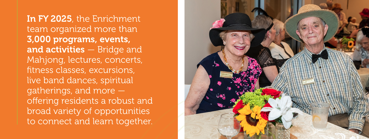
Then, as you begin to compile the outcomes (stories and data) you want to share, consider those that best support your leading concepts. Sort each story or data point under its corresponding pillar. As an example, see a page from Lenbrook’s Annual Report, under their “Connect" pillar:
In FY 2025, the Enrichment team organized more than 3,000 programs, events, and activities, offering residents a robust and broad variety of opportunities to connect and learn together.
Day 7: Leverage multiple forms of data.
In nonprofit circles, I keep seeing this idea that “storytelling” = compelling and “data heavy” = boring. This drives me absolutely insane!!! In my mind there is NOTHING more compelling than data that proves a point.
DATA can mean facts, statistics, observations, or lived experiences — not just numbers. Clean, meaningful statistics are difficult and expensive to compile, so use all the forms of data at your disposal. A photo is a data point. A quote is a data point. Ongoing program participation is a data point. Partnerships with credible brands are data points!
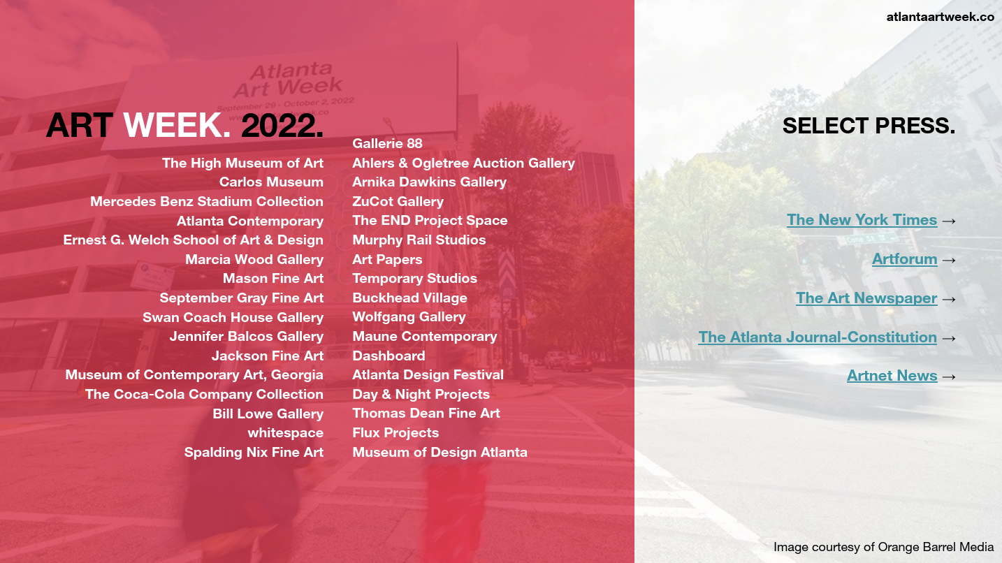
For example, even when Atlanta Art Week was in its early stages, the initiative secured partnerships with the city's leading galleries, cultural institutions, and media brands. This slide from a past pitch deck establishes credibility by listing collaborators.
Day 8: Present data as evidence of progress rather than isolated numbers.
Don’t fall into the trap of sharing meaningless numbers! You’ll dilute your report’s message.
We’re conditioned to believe that numbers, by default, communicate concrete evidence, which can tempt us to present bold, colorful numbers that carry no message. Consider two versions of the same metric:
- 4,500 students participated in VIP.
- The 4,500 students who participated in VIP demonstrated 9% higher job placement rates before graduation than students who did not.
See what I mean? Point #2 tells you what VIP is all about, while point #1, when you think about it, doesn’t give you any meaningful information.
Often, we put numbers in big, bold print, which is half the battle — but still requires the reader to dive into the fine print narrative for context. DO NOT ASSUME that your reader has the context needed to interpret your organization’s impact metrics. Conversely, when we present those numbers as proof points — as specific pieces of evidence that build credibility — that bold print can tell the story all on its own.
Day 9: Skip table stakes and highlight differentiators.
We’ve got a good bit of our content outlined now, so let’s turn our focus to BREVITY!
“Table stakes” refer to the minimum requirements needed to operate in your field, and I don’t recommend you rely on them. If every organization in your sector can make a particular claim, that data point does not differentiate your impact.
Instead, use your impact report to communicate information that will surprise, impress, or inspire readers. Spotlight the aspects of your work that reinforce why supporters choose your organization over others.
This is another place an outside perspective can help you stand apart. Magenta can help you distinguish what’s merely expected and what’s truly compelling about your organization’s work. With deep expertise in both nonprofit operations and funder expectations, we can introduce an unbiased approach and help you to create a report that stands out in a crowded landscape.
Day 10: STAY ON THEME!
Now that we’ve compiled all our content, it’s time to start editing what we’ve got. Keep in mind the three C’s I mentioned at the beginning of this post: Clear, Concise, and Compelling. A disciplined message is one of the biggest markers of a compelling impact report.
Review the content you’ve assembled and be ruthless in striking through superfluous information. If content falls outside the theme, it falls outside the report.
A couple thoughts to underscore here:
- “Staying on theme” doesn’t mean repeating your mission on every page. If you frame each outcome within the corresponding mission pillar you used as your section header, your priorities will speak for themselves. Avoid redundancy across sections.
- Again: resist the temptation to “fit everything in.” Focused reports are easier to read and more memorable. There is no need to create a catch-all section for leftovers! If you MUST allude to activities that fall outside your theme, find a relevant place in your report to link a webpage with more information.
- If you’re finding that your “pillars,” or section headers, don’t line up with the content you feel is critical to present in your impact report, your organization likely has a disconnect between mission, activities, and impact. This is when you call Magenta to help you tease out that disconnect and realign purpose with impact metrics.
Day 11: Show. Don’t tell.
Words have their place, but remember, we don’t have a lot of time to capture our audience’s attention. Let photos and graphics do the heavy lifting and use words to add context.
Also keep in mind what we discussed a few days ago — photos are data! Use images as proof points: each photo or chart should align with and reinforce the story being told.
Reserve plenty of space in your report to make your photos BIG! Text is reserved for context, explanation, and nuance. A few examples:
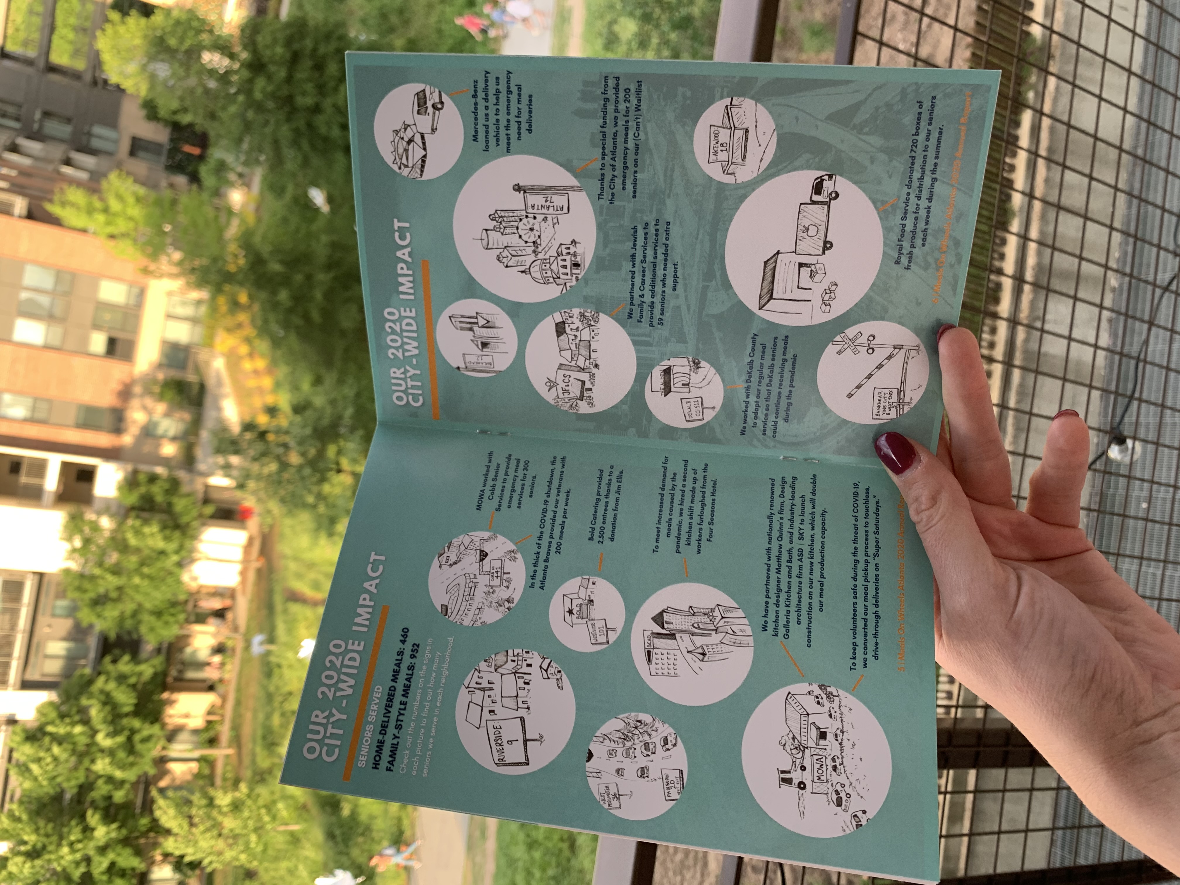
Meals On Wheels Atlanta showcases impact bullets with fun illustrations.
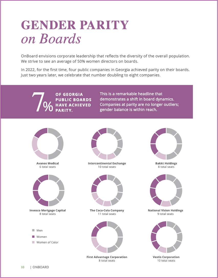
OnBoard's Annual Study visualizes the demographic makeup of Georgia public company boards that have achieved gender parity.
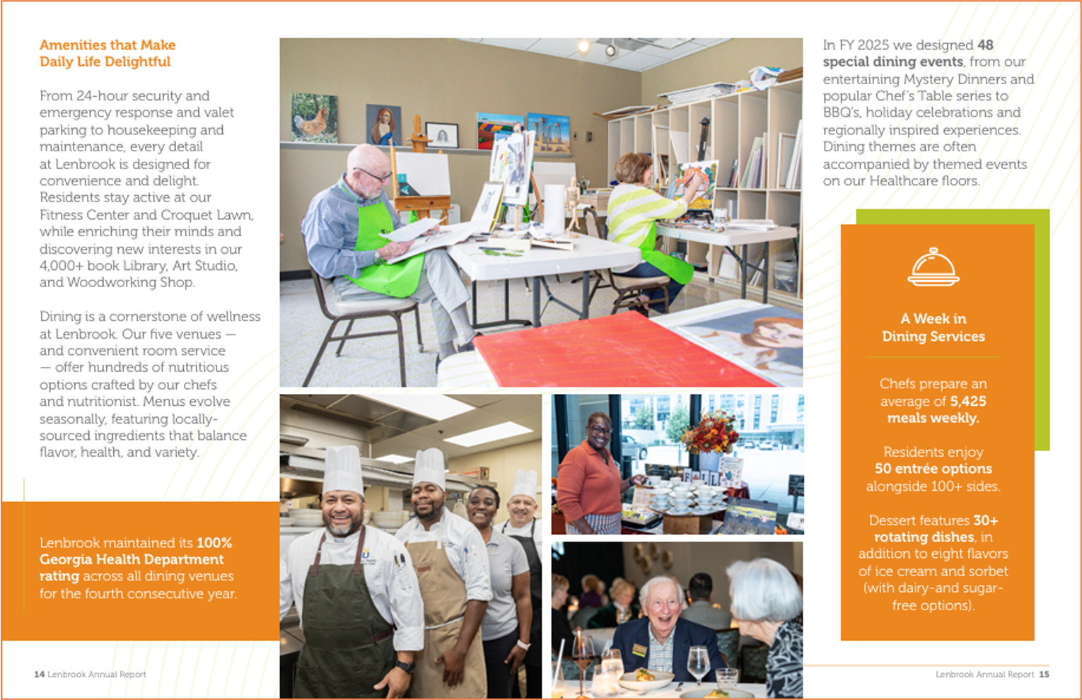
Photos illustrate life at Lenbrook.
Day 12: Distribute your impact report’s highlights with a summary.
Whew — we made it!
You’ve done the hard work of articulating your impact. Now it’s time for the most important step: getting it in front of people who will engage with it.
I recommend assuming that your readers are busy or distracted (so they won’t read the whole thing), but eager for clarity (so they’ll appreciate that you took the time to put it together). So, package your report in formats that meet donors where they are.
Go back and revisit Days 1 and 2: You need to have a distribution strategy. If you’ve scheduled your impact report for release during an event, make sure to allocate time for a speaker to share its highlights. If you’ve created your impact report as a slide deck, don’t let it sit on a shelf; sharing it, whether at live events or via targeted emails, is as important as putting it together.
Finally, consider supplementing your full impact report with an EVEN BRIEFER summary for broad distribution, like a one pager, an email newsletter digest, or a carousel post for social media.
If you’re sad to see this series come to an end, then for further reading, you can check out this case study we wrote earlier this year about pairing long documents with one-page summaries. Or, if we’ve piqued your interest in further strategy and report assistance, we invite you to schedule a discovery call with us!
Now . . . go forth and share your impact!


